AVAIL OF OUR LIMITED time introductory OFFER for JUST $25!
5 Design Mistakes That Make eBook Covers Look Unprofessional
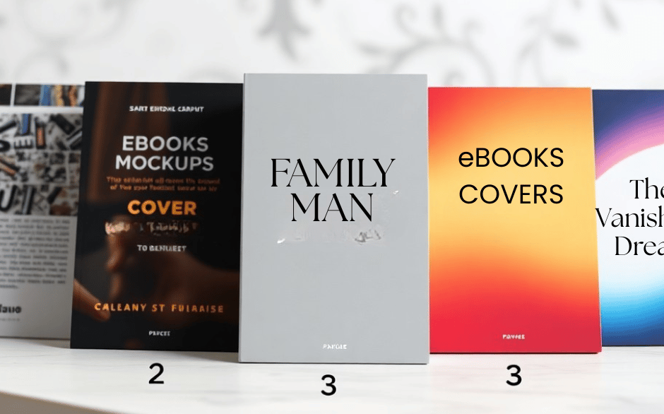
Just because you can fit many elements on a cover doesn't mean you should; poor typography, cluttered composition, low-resolution images, inconsistent color and weak hierarchy are five common design mistakes that make your eBook look unprofessional. Fixing type choices, simplifying layout, using high-res images, aligning colors with genre, and establishing clear hierarchy will improve credibility and sales potential, and you'll present a cover that communicates genre and quality at a glance.
BOOK COVER DESIGN TIPS
Clean Cover Designs
12/18/20258 min read
Mistake 1: Poor Typography
Poor typography signals amateur design immediately: mismatched fonts, unclear hierarchy, and text that disappears at thumbnail size make readers scroll past. You should use typography to communicate genre and tone quickly - a single strong title treatment backed by one complementary font for the author or subtitle is far more effective than a collage of type styles. Aim for the title to take roughly 15-25% of the cover height so it remains legible when reduced; test at retail thumbnail sizes, which are often under 200×300 pixels.
Frequent production standards still apply: export covers at 300 ppi and check clarity at 100% and at small scales. You must balance visual flair with function - decorative scripts or ultra-thin fonts can look elegant on a full-size canvas but vanish on mobile. Use consistent spacing, predictable kerning, and a clear hierarchy (title > subtitle > author) so your cover reads instantly in a crowded catalog.
Font Choices
Choose fonts that match your genre and stick to one or two families. For example, literary fiction often uses high-contrast serifs like Playfair Display or Baskerville; thrillers benefit from condensed sans or slab serifs such as Bebas Neue or Rockwell; non-fiction and business covers commonly use clean sans-serifs like Montserrat or Futura. Avoid novelty faces such as Comic Sans or Papyrus and resist mixing more than two distinct typefaces - instead, vary weight and style within a single family to build hierarchy.
Pairing should focus on contrast in x-height and weight rather than ornament. If you need a more decorative headline, pair it with a neutral body font and keep spacing open: small tracking increases legibility for caps-only titles, while tighter tracking can work for longer words only if you test at thumbnail scale. Use font-pairing tools or curated Google Fonts combinations to speed decisions and maintain professional cohesion.
Readability Issues
Contrast and weight determine whether your text survives a quick glance. Aim for contrast ratios higher than 3:1 for display text and consider 4.5:1 if your title uses thin letterforms; online contrast checkers can give exact numbers. Avoid placing important copy over busy image areas without a solid backing - a semi-opaque rectangle or gradient behind the text often improves legibility more than a decorative shadow.
Size and stroke thickness matter as much as contrast: choose a bold or semi-bold weight for the title, keep subtitles no smaller than visually comfortable at thumbnail, and set line-height around 1.1-1.4 for short cover lines. Test the cover in grayscale to ensure outlines, shadows, or color shifts aren’t the only things keeping the title readable; if the title blurs in monochrome, it will struggle on low-resolution devices.
Practical checklist: run a contrast ratio test, view your cover at 10-20% scale to simulate mobile thumbnails, check for minimum stroke thickness (avoid hairline serifs under small sizes), and try versions with and without text effects (outlines, embossing). If your title fails any of these quick checks, adjust weight, spacing, or background treatments until the words read cleanly at a glance.
Mistake 2: Cluttered Design
Overcrowding Elements
When you pack a cover with too many visuals-multiple images, decorative flourishes, long subtitles and several logos-the hierarchy dissolves and nothing reads at thumbnail size. Limit yourself to 1-3 focal elements: a dominant image or icon, the title and an author credit. For example, best-selling nonfiction covers often use one bold photograph, a large title and a small subtitle; recreating that balance on your cover helps viewers instantly identify genre and intent even at 60-100 pixels wide.
Apply visual weight deliberately by choosing a single focal point and simplifying secondary items. Use size contrast (title 1.5-2× larger than author text), color contrast, and alignment grids to guide the eye. If you find more than five distinct shapes or type blocks on your mockup, start removing or combining elements until the message reads clearly in a scaled-down preview.
Lack of White Space
Too little breathing room makes even high-quality photography and typography look amateurish; you want space that frames content and creates a clear reading order. Aim to reserve roughly 8-12% of the cover width as margin on each side so titles and images aren’t jammed into the edges, and increase line-height for multi-line titles-try 1.15-1.4 for display text and 1.4-1.6 for subtitles to improve legibility.
White space also conveys professionalism by signaling intentional design choices rather than accidental clutter. Test your cover at typical retailer thumbnail sizes: if letters touch the crop or overlapping graphics obscure the title, adjust padding and reduce ornamentation until the title remains isolated and readable.
Practical fixes include removing background textures that compete with text, converting busy photos to duotone or simple gradients, and using a grid to maintain consistent gutters; those steps often transform a cramped cover into one that reads confidently across devices.
Mistake 3: Inconsistent Branding
Cover vs. Content
If your cover signals one thing and the interior delivers another, you lose trust and conversions quickly; a thriller cover that uses soft pastels and whimsical imagery will attract the wrong reader and generate lower reviews and higher refund rates. You should align mood cues-typography, imagery, and layout-with the book’s voice: dark high-contrast photos and sans-serif headlines for suspense, warm portraits and flowing serifs for literary or romance, and clean geometric layouts for business or self-help.
Keep structural elements consistent across a series or author catalogue so readers can recognize your work at a glance. Use the same hierarchy for title, author name, and series badge, and keep relative sizes within a narrow range (author-name scale within roughly ±10% across covers) so thumbnails form a coherent shelf. Small consistency choices-same spine treatment, logo placement, or corner crop-can lift perceived professionalism and series discoverability on retail pages and social thumbnails.
Color Schemes
Choose a primary, secondary, and accent color and apply them systematically: a two-to-three color palette with tints and shades gives variety without chaos. You should match color tone to genre conventions-reds and blacks for thrillers, muted blues and grays for business, warm pastels for romance-while avoiding one-off hues that make a single title stick out for the wrong reasons.
Be rigorous about legibility and contrast: follow WCAG contrast guidance (at least 4.5:1 for body-sized text or 3:1 for large display type) to ensure titles read at thumbnail sizes. Test color combinations in grayscale and at thumbnail dimensions so you know whether your hierarchy holds when the image is reduced; a high-contrast title over a busy photo often outperforms a low-contrast treatment even if the full-size version looks more subtle.
For digital covers, work in RGB and validate how colors render on common devices-smartphones and e-readers render saturation differently-then check final files at typical thumbnail resolutions (for example, around 100×150 pixels) to confirm that your chosen palette still conveys the intended genre and mood.
Mistake 4: Low-Quality Images
Resolution Concerns
If your source image is under 1,600-2,560 pixels on the longest side you'll risk a soft, pixelated look when retailers generate larger display assets or readers zoom in; many major platforms recommend around 1,600-2,560 px on the longest edge and an aspect ratio near 1.6:1 for optimal results. For print you should work at 300 PPI with bleed and CMYK color, but for digital covers focus on pixel dimensions and export quality-save a high-quality JPEG (minimal compression) or PNG from your master file so thumbnails and zooms remain crisp.
Test your cover at small sizes before finalizing: scale it down to 140-160 pixels tall (common store thumbnail height) and confirm title and author name are legible. When you composite elements, start with the highest-resolution pieces possible; upscaling low-res bits with software like Photoshop will create visible artifacts and jagged edges that make the whole cover read as amateur.
Stock Image Pitfalls
You can easily pick a stock photo that looks fine at full size but reads generic or low-effort in market context-images like silhouetted figures on a beach, hands clasped in handshake, or a stack of books show up on hundreds of covers and immediately age your design. Licensing is another technical issue: some stock providers require specific commercial or extended licenses for book-cover use, and images with identifiable people often need valid model releases for commercial distribution; check the vendor terms before you buy.
When you combine multiple stock elements, mismatch in lighting, perspective, resolution, or grain betrays the composite. Match focal length and depth of field, add consistent color grading and grain, and anchor foreground elements with shadows to sell realism; otherwise viewers will notice the paste-together look even if individual pieces are high-res.
Do a reverse-image search on any stock photo you're serious about-if it appears on dozens of other book covers, choose something else or commission a custom shoot/illustration; uniqueness increases perceived value. If budget allows, licensing an exclusive image or hiring a photographer/illustrator (rates commonly range from $150-$1,500+ depending on complexity) will avoid repetition and sidestep potential licensing headaches down the line.
Mistake 5: Misleading Cover Art
Misleading cover art breaks the trust you need to convert a scroller into a buyer; when the image, typography, or color palette promise one experience and the book delivers another, you will see poor click-throughs and negative reviews that call out the mismatch. Think in terms of immediate expectations: covers communicate genre, tone, and pacing in a single glance, so a mismatch between cover and content often costs you 1-3 potential sales for every reader who moves on after being confused.
Fixing this starts with mapping your cover elements to reader expectations: colors, photographic style, iconography, and type should all signal the book’s core promise. If you align those elements with the category bestsellers-in placement, scale, and mood-you’ll reduce returns and the “misleading cover” complaints that show up in buyer feedback.
Genre Mismatches
You cannot mix the visual language of two genres without consequence; a gritty thriller that uses glossy, pastel rom-com imagery will repel the exact audience you want. For example, thrillers sell with high-contrast photography, stark sans-serifs, and muted palettes, while commercial romance favors warm tones, soft focus, and script or hand-lettered titles-borrowing the wrong style confuses the shopper and lowers conversion against the top 10 competitors in your category.
Audit your competitors: pick three bestselling covers in your category and note recurring design tropes-layout, imagery, and font choice-then apply those signals to your cover while keeping one unique touch. You’ll maintain recognizability on a crowded listing page and ensure your cover speaks the same genre language as the readers you want to attract.
False Advertising
Using imagery or copy that promises scenes, themes, or stakes you don’t deliver amounts to false advertising in practice, and you will pay for it with negative ratings and refund requests. If you plaster a badge like “A Detective Thriller” across a cozy mystery cover, readers expecting hardcore procedural detail will feel cheated; similarly, a cover that implies a historical setting when the text is contemporary creates cognitive dissonance and poor word-of-mouth.
Stay honest with your visuals and headline copy: match the cover to the book’s strongest selling point instead of an aspirational image that’s meant to broaden appeal. Test alternatives with a small group of target readers-if multiple people say “this looks like X” and X is not what your book is, redesign until perception and content align.
One practical check is to pair your final cover with the book’s first page and two-sentence blurb; if a reader can’t correctly identify genre, tone, and primary conflict in that pairing, the cover is misleading. You can also run an A/B test on your sales page or use a cover critique group of 10-20 readers to catch mismatches before launch.
Final Words
The five common design mistakes - poor typography, cluttered layouts, low-resolution imagery, weak visual hierarchy, and poor color/contrast choices - can make your eBook cover look unprofessional and limit its appeal. You can correct these issues by choosing type that reads at thumbnail size, simplifying composition so every element serves a purpose, using high-quality images or illustrations, establishing clear hierarchy, and testing color and contrast for legibility.
When you apply these principles and iterate based on real-world thumbnails and feedback, your cover will communicate genre and quality at a glance and invite readers to click. Make deliberate choices for every element on the cover, test how it performs in context, and refine until your design reliably conveys the promise of your book.