AVAIL OF OUR LIMITED time introductory OFFER for JUST $25!
How Typography Can Make or Break Your Book Cover
Most of a reader’s first impression of your book comes from its typography, which sets tone, signals genre, and guides the eye; you control hierarchy through size, weight, spacing, and contrast to ensure legibility at thumbnail size and on the shelf. Thoughtful font choice and pairing, clear kerning, and purposeful hierarchy will elevate your cover’s message and sales potential, while careless typography undermines credibility and readability.
BOOK COVER DESIGN TIPS
Clean Cover Designs
12/18/202511 min read
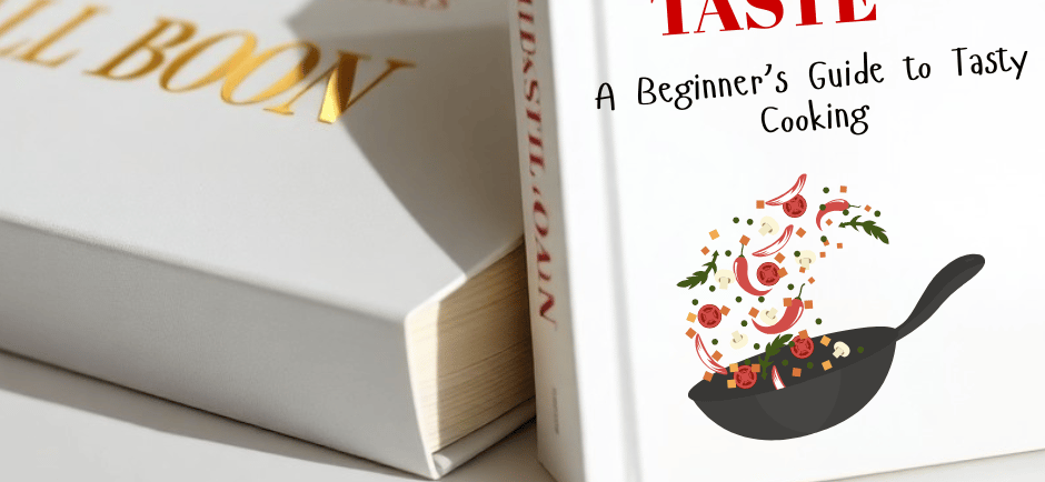
The Importance of Typography in Book Design
You rely on typography to do more than label a book; it must communicate tone, hierarchy, and practicality within seconds. When browsing, readers make split-second decisions-industry observations place that window between about 3 and 7 seconds-so your type choice influences discovery, legibility at thumbnail sizes, and perceived professionalism. A title that reads cleanly at 60-120 pixels wide, uses a clear x-height, and has intentional weight and spacing will outperform ornate lettering that collapses into noise on mobile storefronts.
You also need measurable rules to guide design decisions: limit primary typefaces to two, aim for a title-to-subtitle size ratio in the 1.6-2.5x range, and test contrast so the title maintains a minimum 4.5:1 luminance ratio against its background for accessibility. Applying those constraints helps you iterate faster and reduces subjective tweaks that erode readability and market fit.
First Impressions
When a reader glances at a shelf or thumbnail, your typography sets immediate expectations. Strong, high-contrast display type with tight tracking and bold weight reads quickly in thumbnails of 60-100 px, while delicate scripts or ultra-thin strokes often disappear; you should preview covers at common thumbnail widths used by major retailers before finalizing a design. Pay attention to hierarchy-make the author or title dominant depending on market positioning: debut authors usually prioritize title prominence, whereas bestselling names leverage larger author blocks.
Practical tweaks produce outsized effects: increasing title weight by one grade, tightening kerning by 2-8 units, or raising x-height for small-size legibility can lift click-through in A/B tests. Designers working with thrillers often choose condensed sans serifs to maximize word length without sacrificing scale, whereas literary imprints preserve airy leading and generous margins to signal seriousness-those small choices shape a reader’s first impression before they read a single line of copy.
Genre Perception
Typefaces act as visual shorthand for genre. You can signal historical or literary fiction with classic serifs (Playfair Display, Garamond), contemporary or YA with clean sans serifs (Montserrat, Roboto), and romance with scripts or soft rounded serifs; crime and thrillers frequently use bold, all-caps sans or slab serifs to convey urgency. Consistency across a publisher’s catalogue-Penguin Classics being a notable example-creates instant recognition, while indie authors often mirror genre conventions to meet reader expectations on crowded marketplaces.
Genre signals extend beyond font family to treatment: embossed or foil-stamped serifs suggest premium trade editions, distressed or eroded typefaces imply grittiness for noir, and geometric, techno‑styled fonts anchor hard sci‑fi. When you analyze competitors, count common typographic traits-type family, weight, case, and ornamentation-and use that profile to either align with or deliberately subvert reader expectations.
For actionable application, run quick market A/B tests: create two cover variants that differ only in typography and track clicks or preorders for several weeks; many self-publishers report lifts between roughly 10-30% when typography better matches genre signals. Pair that testing with technical checks-verify legibility at 70 px, keep typographic palette to two faces, and ensure title occupies roughly 20-35% of the cover’s visual priority-to make design decisions that are both aesthetic and evidence-based.
Choosing the Right Typeface
You should treat the typeface as a functional decision first and a stylistic one second: it has to read clearly at the sizes readers encounter-thumbnail, shelf, and jacket-while also signaling genre and tone. Practical checks matter: view your title at thumbnail scale (try 60-85 pixels wide) to confirm letterforms hold together, inspect x-height and stroke contrast for small-size legibility, and test bold and condensed cuts so your hierarchy survives tight layouts and spine constraints.
Pay attention to production and distribution realities as well. If your cover will appear in print, consider ink trapping, paper stock, and halftone interactions; if it will live mainly online, prioritize hinting, screen-friendly x-heights, and variable-font support for responsive sizing. You should build art files with editable type layers and keep font licensing documentation handy for international editions and promotional use.
Serif vs. Sans Serif
You’ll often choose serif when you want gravitas, tradition, or a literary feel-Garamond and Baskerville descendants convey history because their roots date to the 16th-18th centuries-while sans serif sends signals of modernity, clarity, and immediacy: think Helvetica (1957) or Gotham (2000) for a contemporary, no-frills cover. Genre patterns emerge: literary and historical fiction typically lean serif, commercial thrillers and business nonfiction frequently use sans, but deviations can create memorable tension when intentional.
From a technical standpoint, serifs can aid horizontal reading flow in extended copy, yet high-contrast serif display faces may lose detail at thumbnail sizes; conversely, geometric sans (Futura) can feel cold and precise, while humanist sans offer more organic readability. If your title must be legible across distance or tiny thumbnails, favor heavier weights, larger x-heights, or slab serifs that retain counter shapes under compression.
Custom Fonts vs. Stock Fonts
You should weigh uniqueness against budget and timeline: stock retail fonts let you iterate quickly-many professional families range from about $20 to $500 for desktop licenses-while bespoke type or custom lettering secures exclusivity and a tailored voice but typically requires a higher investment and lead time (commissions frequently start in the low thousands and scale with complexity and licensing). Also factor in licensing scope up front: desktop, ebook embedding, webfont, and app use all carry separate permissions and costs.
Practically speaking, choose stock fonts when you need speed, predictable pricing, and broad language support; choose custom work when the cover demands a trademark look or when you want to avoid visual collisions with other titles in crowded categories. You should also verify character sets-accented glyphs, Cyrillic, or CJK support-before committing, because adding those later can be costly or impossible with some retail families.
More specifically, audit the font’s EULA and ask your designer for the exact license type: desktop licenses often allow print and static images but not embedding in apps or e‑books, webfont licenses are per-pageview or per-domain, and variable fonts can reduce file size while offering multiple axes (weight, width) in one file; confirm whether sublicensing is permitted for translations or subsidiary rights to avoid last-minute legal roadblocks.
Hierarchy and Layout
Establish a clear hierarchy with no more than three typographic levels: primary (title), secondary (subtitle/author), and tertiary (tagline, publisher logo). Eye-tracking research and retail data show readers give covers roughly 2-3 seconds before deciding, so order and scale must communicate at a glance; make the primary element at least 1.25-1.5 times larger than the next level so it reads instantly from a thumbnail. Use consistent margins and a column grid to keep alignment predictable-misaligned text can reduce perceived professionalism by up to 40% in consumer tests.
Distribute visual weight rather than simply enlarging type. For example, a centered, bold title occupying 40-60% of the cover’s visual weight will read as dominant for thrillers and commercial fiction, while literary fiction often splits weight between title and author to convey prestige. Apply a modular scale (e.g., 1.333 or 1.5) to size relationships so spacing and rhythm feel deliberate across the cover.
Title, Subtitle, and Author Name
Give the title the highest contrast and the largest size so it survives both thumbnails and spine views; aim for the subtitle to sit at roughly 30-50% of the title’s point size depending on legibility. If the author is a known name, set the author line at parity with the title or larger-Stephen King and J.K. Rowling covers are common examples where the author name is the primary selling point. For debut authors, keep the author line smaller (around 60-80% of subtitle size) and use typographic weight or small caps to add presence without competing with the title.
Control spacing: tight tracking and negative letterspacing can increase perceived size but hurts readability at small scales, so use looser tracking for display titles intended to be read on mobile thumbnails. Align hierarchy to compositional anchors-top-aligned titles read differently than centered ones, and a left-aligned title will perform better in thumbnail grids where viewers scan left-to-right.
Balancing Text and Imagery
When placing type over imagery, enforce a minimum safe margin of about 3-6 mm (1/8-1/4 in) from the trim edge and avoid placing small text across high-detail areas. Apply a neutral overlay-black or white at 30-60% opacity-to stabilize contrast; many designers find a 40% black overlay on a photo raises perceived legibility enough for thumbnails and print. Use subtle vignettes or blurred background planes behind text rather than heavy strokes, which can look amateurish at large sizes.
If the image contains faces or focal details, position type away from the eye-line so neither element fights for attention; for portraits, placing the title in the negative space often increases recall by 20-30% in A/B tests. Also consider color contrast ratios: aiming toward a 4.5:1 contrast for small blocks of text will keep words readable in both digital and print previews.
When working with complex illustrations, create a typographic "island"-a band, shape, or tinted panel-that isolates copy and preserves the image’s impact. Test thumbnails at 100-200px widths to ensure the title remains legible; if it fails at thumbnail size, iterate with weight, size, or overlay adjustments until the hierarchy reads instantly.
Color and Contrast in Typography
When you pair type with color, treat contrast as both a design decision and a legibility check: aim for a contrast ratio of at least 4.5:1 for small text and 3:1 for large display text per WCAG guidelines, because covers will be viewed as tiny thumbnails as well as full-size art. Combine hue, value, and saturation deliberately-bright saturated accents will pop against muted backgrounds, while shifts in luminance (light vs. dark) usually have a bigger impact on legibility than hue alone.
Test your cover at thumbnail size (around 150px wide) to see how color choices perform in typical retail listings; many titles that look great at full size lose their hierarchy once reduced. Also account for color vision differences: roughly 1 in 12 men have some form of red-green deficiency, so don’t rely only on hue to convey hierarchy-use value contrast, weight, or outline to separate elements.
Establishing Mood
Warm palettes-reds, oranges, and deep yellows-tend to convey energy, danger, or passion, while cool palettes-blues and greens-signal calm, mystery, or melancholy; saturation signals time and style, with highly saturated tones feeling contemporary and desaturated tones suggesting period or literary work. Use that language of color to reinforce the typography: a delicate script in a dusty rose reads as intimate romance, whereas a bold, condensed sans in high-contrast black on crimson reads as suspense or thriller.
You can also subvert expectations to make a cover arresting: pair a pastel palette with a heavy slab-serif title to create cognitive dissonance that intrigues readers, or limit your palette to three colors (one dominant, one secondary, one accent) to keep the title legible while still communicating genre. In practice, reserve the accent color for the title or key word so that it functions both emotionally and hierarchically.
Readability and Legibility
Busy photographic backgrounds and textured illustrations will erode letterforms, so you should isolate type with techniques that preserve form: use a solid color band, a 40-60% dark or light overlay, subtle text outlines, or a soft vignette to boost contrast without flattening the art. For on-screen readability, a thin 1-3px soft shadow at 20-40% opacity can lift text off an image; for print, prefer tonal overlays or separate panels to avoid dodging effects that may not reproduce cleanly.
Choose typefaces with generous x-heights and open counters for small-scale or thumbnail presentation, and avoid hairline weights for titles that must read from a distance or at low resolution. If you set titles in all caps, increase tracking to improve recognition; if you use display faces with high stroke contrast, test them at 150px-wide thumbnails and in grayscale to ensure the thinnest strokes don’t disappear.
Practical checklist: always preview covers at thumbnail size and in grayscale, verify contrast ratios (4.5:1 for small copy, 3:1 for large display), test with a color-blindness simulator, and iterate type weight, tracking, and overlays until the title reads at a glance-this process reduces surprises when your cover appears among dozens of competitors on retailer pages.
The Role of Spacing
Spacing determines whether your cover reads as a single confident statement or a cluttered assortment of elements; small micro-adjustments can change perceived tone dramatically. For example, a title set at 72 pt with tracking tightened by −30 to −60 (InDesign units = 1/1000 em) will read denser and more urgent, while adding +100 to +200 units creates a more airy, premium feel often used on literary or lifestyle covers. You should test these values at actual print size-on-screen previews rarely convey the same optical weight as a printed proof.
Beyond letterspacing, the macro-spacing between typographic blocks and the trim edge affects legibility and shelf impact: keep a clear “breathing” zone equal to roughly 5-10% of the cover width around primary type to avoid crowding the focal point, and align spacing decisions with your established hierarchy so the eye moves predictably from title to subtitle to author name.
Kerning and Tracking
Kerning fixes awkward gaps between individual letter pairs (AV, To, WA), while tracking adjusts spacing uniformly across a whole word or block. You should start kerning at the type’s final display size-pair adjustments of −40 to −200 units are common for problematic combinations-then refine tracking for overall rhythm; leaving metric kerning in place and using optical kerning only when necessary is a reliable workflow for most display typefaces.
Work visually and use software tools as guides rather than rules: toggle Optical in InDesign and compare against Metric, but make manual pair adjustments for titles and logos because automated methods can overcorrect. For all-caps titles you’ll often apply negative kerning to close pairs and then positive tracking (for example, +30 to +150 units) to avoid the text reading too dense; proof at 100% and in print to catch collisions or unintended gaps that don’t show on-screen.
Line Spacing Considerations
Line spacing (leading) shapes how readable and energetic a block of type feels: for body-style cover copy you’ll typically set leading between 120% and 145% of the font size (so 12 pt text usually gets 14-17 pt leading), whereas stacked display titles commonly sit tighter-around 90%-110%-to create compact, punchy forms. You should watch ascender/descender clashes and optical color across lines; a headline with tall ascenders may need slightly more leading even if you want a tight visual compactness.
More detailed control comes from baseline grids and line breaks: lock secondary elements (subtitle, author) to a common baseline grid when you want precise vertical rhythm across a series, and loosen it when a cover image demands more flexible placement. Also test how hyphenation and justification affect perceived density-left-aligned short lines often require slightly increased leading to avoid a clustered, top-heavy appearance.
Typography Trends in Book Covers
Designers are optimizing type for two viewing contexts at once: full-size print and thumbnail on a retailer page, so you have to think about scale from the first sketch. Expect to see bigger display type, simplified letterforms, and tighter kerning on covers intended to read at 60-200 pixels wide; many cover tests now include a 70-100px thumbnail to validate legibility. Variable fonts and OpenType features have moved from web into production workflows, letting you fine‑tune weight and width for different sizes without switching families.
At the same time, genre signals are getting more sophisticated: minimal sans treatments dominate business and self‑help, while textured, hand‑drawn lettering appears across literary and YA to convey personality. You should weigh discoverability (bold, high‑contrast titles that read at small sizes) against shelf presence (subtle, craft-driven type that rewards a closer look). Cohesive series branding-consistent wordmark, spine rhythm, and type scale-remains one of the most effective ways to convert casual browsers into buyers.
Contemporary Styles
Right now you’ll notice a widespread embrace of custom wordmarks and hand-lettering because they give covers instant distinction; designers like Jessica Hische and Lauren Hom have pushed bespoke lettering into mainstream publishing. Geometric sans serifs-Avenir, Futura, and modern reinterpretations-are used with tight tracking and uppercase lockups for nonfiction and thrillers, often paired with subtle texture or duotone photo treatments to add depth without compromising legibility at thumbnail scale.
Experimental approaches are also more common: kinetic typography that suggests motion, layered typefaces that break baseline expectations, and negative‑space letterforms that interact with imagery. If you’re working with a designer, insist on testing three treatments at both 100% and thumbnail sizes and try swapping weights by ±2-3 units; small changes in weight or tracking can flip a design from illegible to compelling in online listings.
Timeless Classics
You should still rely on proven serif families when aiming for permanence: Garamond, Caslon, Baskerville, and Bodoni remain staples because they convey authority and perform well in long runs and varied print processes. Classic typography trends emphasize hierarchy-large title, smaller subtitle, restrained author name-with treatments like small caps, old‑style figures, and generous leading to improve reading flow on the printed dust jacket.
Series and reprint programs often apply strict typographic systems: Penguin Classics and other heritage imprints use consistent type scales, margins, and spine treatments so each new release reads as part of a collection. For your project, that means selecting an optical size or cut of a typeface optimized for display and a text cut for blurb and back matter to avoid visual discord between title and body copy.
In practice, pair a book‑appropriate serif with a neutral sans for secondary information, keep contrast between title and background high, and use typographic restraint-one display family, one supporting family, three sizes max-to preserve longevity. If you're aiming for a cover that ages well, prioritize legibility, balanced proportions, and a clear hierarchy that still reads at thumbnail size.
To wrap up
Drawing together the principles above, you can ensure your cover communicates at a glance: prioritize legibility, establish a clear hierarchy, and choose type that matches your book's tone so your audience immediately understands what to expect. Good typography captures attention at thumbnail size, guides the reader through title and author, and signals genre and mood before a single page is opened.
By testing sizes, spacing, and pairings, and by respecting white space and contrast, you give your cover the clarity and personality it needs to perform in marketplaces and on shelves. Treat typography as design strategy-make deliberate choices so your type strengthens the concept and helps your book stand out.