AVAIL OF OUR LIMITED time introductory OFFER for JUST $25!
What Makes a Book Cover Look “Clean” and Professional?
Just by prioritizing clarity, balanced composition, and restrained typography, you can make a book cover appear polished and professional. Use strong typographic hierarchy, ample white space, a limited color palette, and high-resolution imagery to guide the eye and signal genre. Ensure legibility at thumbnail size, align elements consistently, and remove unnecessary embellishments so your cover reads confidently and communicates its promise to readers.
BOOK COVER DESIGN TIPS
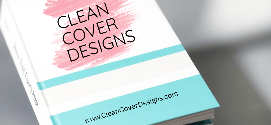
Clean Cover Designs
12/17/202511 min read
Elements of Clean Design
Focus on spatial relationships: a clean cover uses intentional negative space, a clear focal point, and a simple grid to align elements. Use a 2- or 3-column grid to place title, author, and imagery so that margins total roughly 10-15% of the cover width, which helps maintain balance when the design is scaled down. You should limit visual elements to one dominant image or typographic treatment plus one supporting graphic to avoid clutter and preserve immediate legibility.
Be technical about file specs and scale so your aesthetic decisions hold up in production: design at 6"×9" at 300 DPI (1800×2700 px) for print, and preview at thumbnail size to check readability. Apply a clear visual hierarchy-one strong focal treatment, one secondary element, and one subtle credit line-and test the layout at sizes as small as typical online thumbnails to confirm the title still reads at a glance.
Typography Choices
You should restrict your palette to a maximum of two type families and three hierarchy levels (title, subtitle/tagline, author). Pairings that work: a geometric sans for the title (e.g., Futura, Mont) with a humanist serif for the author line (e.g., Garamond, Minion), or vice versa for literary tone. Use weight and size to establish contrast-typographic hierarchy typically spans 2-3 stop sizes, and line-height between 1.2-1.4 times the font size keeps blocks readable without feeling cramped.
Account for thumbnail legibility by favoring higher x-height and bolder weights for the title; thin hairlines and tight letterspacing will disappear when reduced. You should also set tracking for display type (+10 to +30 on condensed fonts often helps) and opt for optical kerning or manual adjustments for large wordmarks to maintain visual rhythm at all scales.
Color Palette Selection
Adopt a 60/30/10 approach: primary background ~60%, secondary elements ~30%, and a single accent ~10% to draw attention to the title or a key motif. Aim for a contrast ratio of at least 4.5:1 between text and background for small type to maintain legibility-this is measurable and helps when covers appear as small thumbnails. Genre conventions matter: thrillers commonly pair black with saturated red, while business books often use restrained neutrals with one bright accent color.
Prepare colors for both digital and print by designing in RGB but converting proofs to CMYK or using Pantone matches for spot color consistency; expect some shift between color spaces, especially saturated blues and greens. You should also test palettes desaturated and in grayscale to ensure the design still reads when color cues are absent.
Further refine palettes by limiting hue count to three or fewer and controlling saturation: a muted background with one saturated accent preserves a clean, professional look and boosts perceived contrast without increasing clutter. Test combinations against your cover at thumbnail scale and in grayscale, and adjust the accent’s luminance so it remains visible against both light and dark backgrounds.
Imagery and Graphics
Strong imagery should support the cover's message without competing with the title or author name; you want visuals that read clearly at thumbnail scale and on the printed jacket. Use high-resolution files for print (300 DPI at final trim size) and simplify complex compositions so the focal point survives downscaling to roughly 100-200 pixels wide on retailer pages. Practical checks-zooming to thumbnail, viewing in grayscale, and squinting at the cover-reveal whether your image retains its intent when size and color are reduced.
Placement and contrast determine whether your artwork enhances hierarchy or creates noise: place the primary visual element to lead the eye toward the title, use a limited palette to prevent chromatic clash, and favor one strong focal point rather than multiple competing elements. For print runs, keep layered source files and identify any embedded rasters that need replacement with higher-resolution or vector versions to avoid pixelation and ink surprises in CMYK conversions.
Use of Illustrations vs. Photography
Illustrations give you control over mood, scale, and symbolism-useful for speculative fiction, memoirs that benefit from metaphor, or children’s books-while photography brings immediacy and a documentary tone that works well for memoir, contemporary fiction, and nonfiction. If you choose illustration, opt for vector assets when possible so shapes remain crisp at any size; with photography, source images at least 3000 pixels on the long edge to keep detail when cropping for print and promotional images.
You should also weigh cost and time: commissioning a bespoke illustration typically runs from a few hundred to several thousand dollars depending on the artist, whereas licensed photography can be cheaper but may require retouching and careful model-release checks. Test both approaches by placing the art in your actual layout and viewing it at thumbnail and full-size-illustration often reads better at small sizes due to simpler silhouettes, while photos require stronger tonal contrast or background isolation to avoid blending into the type.
Importance of White Space
White space-the intentional emptiness around text and imagery-lets your title breathe and immediately improves perceived professionalism; you should avoid crowding elements against trim edges and aim for balanced negative space so the eye can register hierarchy in one glance. Industry practice for print is to keep type and key artwork inside the safety margin (commonly 0.25 inches inside the trim) and maintain at least modest gaps between headline, subtitle, and author name so each element reads independently at thumbnail size.
When designing, treat white space as an active element: you can create emphasis by increasing space around a single word or image, and use asymmetrical spacing to guide the reader’s gaze diagonally across the cover. Try setting your layout on a simple grid (three rows or a 12-column grid) to measure proportions; a practical rule of thumb is to reserve roughly 20-40% of the visible cover for negative space, adjusting based on genre conventions and the strength of your focal graphic.
To refine the effect, run iterative tests: export a 150-pixel-wide thumbnail, toggle color to grayscale, and check legibility from 3-5 feet away or in small screenshots-if elements feel jammed, increase gutters or scale down the image until type has clear breathing room. You can also layer temporary translucent guides in your file to ensure spacing ratios remain consistent across jacket, spine, and back cover during production.
Consistency in Branding
When you keep core elements-typography, color palette, logo placement, and spine layout-consistent across your backlist and series, your books become instantly recognizable to browsers glancing for 3-5 seconds at thumbnails or spines. Major authors and imprints demonstrate this: Stephen King and James Patterson rely on oversized author names for instant shelf recognition, while Penguin Classics uses uniform black spines and centered typography to signal quality and continuity.
Apply templates sparingly so each cover still reads as a distinct title while fitting a cohesive family. For example, Harlequin’s line fiction uses repeatable grid systems and predictable logo placement but varies imagery and accent colors per subseries; that balance lets you maintain discoverability on retailer category pages without producing identical covers.
Aligning with Genre Expectations
You should map visual cues to genre conventions so readers immediately understand what to expect: romance often favors warm tones, soft-focus photography, and script or calligraphic title fonts; thrillers tend toward high-contrast palettes, bold sans-serifs, and a single, often photographic focal element; cozy mysteries commonly use illustrated scenes, rounded type, and lighter color schemes. Examples help-Gone Girl’s stark typography and negative space signal psychological suspense, while many contemporary romances use pastel gradients and couple imagery to convey tone at a glance.
Still, innovate within the boundaries: small departures-an unusual colorway, a photographic treatment in an illustrated subgenre, or a distinctive icon-can make a familiar template feel fresh without confusing genre-savvy shoppers. Test how covers read at thumbnail size (where most discovery happens); if your title and focal image lose clarity at 60-120 pixels, the design isn’t aligning with real-world browsing behavior, no matter how original it is.
Author Branding Considerations
You’ll need to decide whether your name or the title leads the composition based on your career stage and backlist size: authors with five or more titles often benefit from a consistent author-name treatment so readers hunting for the author can spot new releases quickly, whereas debut authors may prioritize a strong title and hook to capture initial attention. Consider also whether a signature logo, a repeatable typographic lockup, or a consistent portrait/headshot on covers will serve your market-nonfiction audiences, for instance, respond well to author faces and credential badges.
Build a simple brand kit with 3-5 colors, two type treatments (one for display, one for body), and rules for name/title hierarchy and spine layout so every designer you work with applies the same system. That kit reduces revision cycles, maintains continuity across formats (ebook, paperback, audiobook), and makes coordinated promotions-box sets, seasonal discounts, or cross-promoted ads-look unified on retailer pages.
Dig deeper by deciding author-first versus title-first layouts and then running small A/B tests in ads or newsletter lists to measure click-through differences; align your metadata (consistent author name formatting across ISBNs and retailer pages) and sync your social profiles-avatar, banner colors, and pinned posts-with cover palettes so discovery on social and retail channels reinforces the same visual identity.
The Role of Professional Tools
You use professional tools to translate design decisions into reproducible, print-ready files: set images to 300 DPI for photographic covers, convert color to CMYK for offset printing, and add a 0.125" (3 mm) bleed on all sides so nothing gets trimmed. Exporting to industry standards like PDF/X-1a or PDF/X-4 preserves color profiles and transparency for printers, while TIFF or high-quality JPEGs work for digital platforms; keeping master files (PSD/AI/InDesign) lets you make future edits without quality loss.
Typography and layout precision come from tools that handle baseline grids, optical kerning, and OpenType features; you’ll notice tighter letterspacing and balanced margins when a designer uses InDesign or Illustrator versus a generic editor. Also use vector assets for logos and line art so spine text and small icons remain sharp at any size, and run a preflight check to catch missing fonts, linked images below 300 DPI, or incorrect color spaces before sending to press.
Design Software Options
Adobe InDesign is the industry standard for multi-page layout and typographic control-its packaging feature collects fonts, linked images, and a print-ready PDF/X export that printers expect. Photoshop remains the go-to for photo retouching and compositing; set your working resolution to 300 DPI, use non-destructive layers, and save a flattened high-res TIFF or PDF for final output. Illustrator handles vector type and logos so spine text and emblems stay crisp at any size.
Lower-cost or free alternatives work for many indie projects: Affinity Publisher/Photo/Designer offer near-parity with a one-time fee (around USD 50-60 per app) and support high-res export; Canva Pro speeds up thumbnails and marketing assets but can limit CMYK workflows and layered deliverables; GIMP and Inkscape are free but require extra steps to prepare print-ready CMYK files. Choose software based on the deliverables you need-packaged master files, print-ready PDF/X, and web-optimized JPEG/PNG for retailers.
Hiring a Professional Designer
Freelance cover costs vary widely: many experienced indie cover designers charge between USD 500 and USD 2,500 for a custom front-cover, while full-wrap covers with custom illustration or photo comps often run USD 1,000-5,000; quick template-based covers can be USD 100-300. Typical turnaround ranges from 1-3 weeks for a single cover plus revisions, with rush fees if you need delivery in days rather than weeks. Platforms like Reedsy specialize in vetted book designers, whereas marketplaces such as Upwork and Fiverr offer a broader quality range-expect to vet portfolios carefully.
When you engage a designer, specify deliverables and rights up front: ask for layered master files (PSD/AI), a print-ready PDF with crop marks and bleed, fonts outlined or licensed, and RGB/JPEG versions optimized for online retailers. Confirm spine width calculations based on page count and paper stock (for example, 0.0025" per page for 60 lb paper is a common starting point), include a revision count in the contract, and require clear licensing terms for cover imagery so you can print, distribute, and market without legal issues.
Ask potential designers for genre-specific examples at thumbnail size (cover legibility at 1:6 scale), client references, and a breakdown of what’s included in the fee-mockups, social-media adaptations, and source files are often billed separately-so you can compare apples to apples before committing.
Trends in Book Cover Design
Current Aesthetic Preferences
Minimal, type-forward covers remain dominant for literary fiction and many contemporary titles: you’ll see large sans-serif or high-contrast serif titling, one dominant visual element, and generous negative space that makes the headline readable from a distance and at thumbnail size. Paperback reprints and frontlist alike favor restrained palettes-muted earth tones, duotone washes, and single-color backgrounds-while genre fiction often flips the script with saturated color-blocking and bold illustrative silhouettes to signal category quickly on a crowded shelf.
At the same time, illustrative hand-drawn art and textured photographic treatments are resurging in romance, YA, and select indie nonfiction, where a tactile, artisanal look supports author brand. You should notice publishers like Vintage and independent presses leaning into this hybrid approach: simple, readable typography paired with a single, well-composed illustration or distressed photo. That balance-clarity in type plus distinctive imagery-lets covers feel contemporary without sacrificing shelf presence.
Influence of Digital Platforms
Because most discovery now begins on screens, you design first for pixels: thumbnails on storefronts and feeds often display between roughly 60-200 pixels wide in various placements, so you prioritize a clear title hierarchy, high contrast, and a single focal element that scales. Algorithms and social formats (Instagram posts, BookTok videos, newsletter thumbnails) favor covers that read instantly in motion or at small size, which is why you’ll see more covers using heavy strokes, high x‑height fonts, and simplified compositions that avoid thin hairlines or fine ornament that disappear digitally.
More info: you should prepare multiple assets-square and vertical crops, a version without a subtitle, and a social-optimized banner-so your cover translates across Amazon, Apple Books, Goodreads, and social platforms. Test legibility at 100% and at thumbnail scale, favoring type that maintains counters and apertures at small sizes; empirically, covers with a dominant wordmark or clear face/shape outperform overly detailed photographic scenes in feed CTRs, so simplify elements and deliver variants to marketing teams for A/B testing.
Common Mistakes to Avoid
You should avoid treating the cover as an afterthought or a place to dump every idea you like; common errors include weak visual hierarchy, low-resolution imagery, and competing focal points. Use 1-2 typefaces, limit your color palette to 2-3 dominant hues, and keep file resolution at 300 DPI for print and at least 1400 px on the longest edge for retailer thumbnails so text stays legible when scaled down.
Poor contrast, cramped kerning, and inconsistent margins are easy to spot and easy to fix, yet they appear on many self-published titles. Run a quick thumbnail test at 60-80 px wide, check legibility in grayscale to verify tonal contrast, and simplify any element that doesn't support the title or the genre signal.
Overcomplicating the Design
You make the cover work against itself when you pack in multiple characters, ornate frames, textured overlays, and six different effects; that complexity collapses into visual noise at thumbnail size. Aim for one primary focal element, one supporting element, and a clear title area-too many focal points split the viewer’s attention and reduce click-through. For example, a fantasy cover that features five characters, a busy map background, heavy grunge textures, and layered glow effects will often underperform compared with a simpler treatment showing a single emblem or silhouette.
Strip back embellishments such as heavy bevels, excessive drop shadows, and tiny decorative flourishes that disappear at small sizes. Instead, increase the negative space around your title, choose type weights with strong x-heights for legibility, and test contrast ratios so the title reads at a glance; following those rules often improves shelf impact and retailer conversion by noticeable margins in A/B tests.
Neglecting Target Audience
You risk alienating buyers when the cover doesn’t signal genre, tone, or intended reader demographic. Genre conventions exist for a reason: thrillers favor high-contrast palettes and bold sans serifs, romance tends toward warm color schemes and softer, emotive imagery, and YA often uses photographic faces or illustrative, high-energy treatments. If your cover strays too far from those signals, shoppers may skip it because it doesn’t match their expectations.
Dig deeper into who you’re targeting-age, gender, reading format and regional market all shape visual choices. Romance readership, for instance, skews female (roughly 70-80%), so covers that emphasize relationship cues, warm palettes, and clear emotional stakes perform better; conversely, a mystery aimed at older male readers might use cooler tones, stark typography, and minimal imagery. Test samples with small audience groups or run paid impressions to see which visual cues produce the highest engagement before finalizing the design.
Final Words
Following this, you can judge a cover's cleanliness by how it balances simplicity and hierarchy: a limited palette, a clear focal point, and strong typographic choices let your title and author name read instantly while supporting imagery remains secondary. White space, consistent alignment, and controlled contrast give your design room to breathe so elements don't compete; when you refine spacing and scale, your cover communicates professionalism without ornament.
If you apply technical discipline - high-resolution images, proper safe margins, and readable type at thumbnail size - your work will look polished across formats and platforms. Trust your decisions by testing thumbnails, comparing against strong examples, and iterating until your cover reads clearly at a glance; that discipline is what makes your book feel professional and market-ready.